Light and soothing interiors are key to creating timeless designs
In this HDB resale flat, Nativ9 Design opted for a “conservatively chic” look that is defined by clean, light and soothing interiors.
Colours are kept to a minimum, with the emphasis placed on neutral hues, minimalist forms and streamlined designs. In keeping with Nativ9 Design’s mission to create timeless designs, this home remains free from overwrought design elements and loud colours.
Sleek and Slender

The team from Nativ9 Design took reference from the school of minimalism when designing the common rooms in this HDB flat. The living room for example, boasts a pristine interior unmarked by heavy feature walls or bulky furniture.
It’s a clean and straightforward design that leaves the room feeling open and expansive, attributes you would rarely find in an HDB home.
Kitchen Space

A straightforward black-and-white scheme takes centre stage at the kitchen.
In the kitchen, a straightforward black-and-white colour scheme takes centre stage.
The design is streamlined and func-tional, with cabinet doors that open vertically to prevent any obstruction of space. An eSpring water purifier is an important addition to the holistic wellness of this home.
Sleepover Solution

Colours are kept to a minimum in this HDB resale flat.
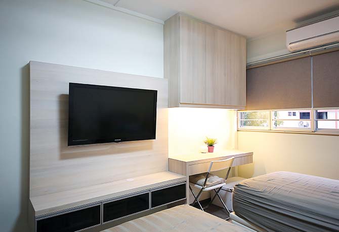
The guest bedroom adopts a lighter design, with blonde wood laminates cladding all the built-in furniture.
In order to maximise every inch of floor space, the design team from Nativ9 Design decided to fully customise the furniture, including the console, study table and storage shelves.
The designers also took into account the needs of the family, and allocated enough space for an additional pull-out bed should more than one guest stay the night.
Split In Two

Two bedrooms were merged into one to make way for a larger master bedroom that could accommodate a walk-in wardrobe.
The designers raised a partition that halved the bedroom: one side for the bed and the other side for the closet and a built-in study table.
With more room to spare, the designers were able to build in more drawers and cupboards to ensure ample storage space.
Colour Definition

Black tiles with subtle white speckling visually defined the wet areas of the bathroom.
The bathroom in this resale HDB flat was slightly bigger than the bathrooms typically seen in newer homes, which gave the designers more leeway.
The fixtures — like the WC, washbasin and under-mount cabinet — are in varying shades of white, but it’s the wall tiles on the shower stall that stand out. Black tiles with subtle white speckling visually defined the wet areas of the bathroom.
In The Corner

When space is scarce, one of the best solutions is to customise furniture that fits into the exact dimensions of a room. In the master bedroom, an integrated dresser fits snugly into what would have been an empty, unused corner.
The addition of mirrors and spotlights also helped to brighten up the space and prevents it from looking dark and unwelcoming.
By Redzman Rahmat
Article first published in Lookbox Living #40 Mar/Apr 2015
Lookbox Living #44 is out now! Available at major bookstores and news stands!
For more interior projects, visit www.lookboxliving.com.sg
ADVERTISEMENTS


Leave a Reply