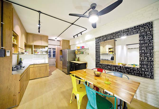
[dropcap]T[/dropcap]he owners of this 5-room HDB resale flat approached Pavillion Creation with a strong vision of what they wanted their home to look like. The design brief was straightforward: an open-concept home that is inspired by the airy spaciousness of the much-loved New York loft.
To achieve this ambitious look, the design team reconfigured the layout of the flat and used a cohesive material palette.
Wood Venture

The entrance to the kitchen was knocked away to create an open layout that is popular in lofts. This also allowed the designers to inch the dining room closer to the kitchen, creating a seamless two-in-one workspace for the owners.
As with the rest of the home, the design team picked a material palette made up of nature-inspired colours and surfaces like wood and bricks.
Loft Lifestyle

Taking a leaf from its New York inspiration, the designers used only a single type of flooring in all the rooms with the bathrooms being the exception. The luxurious veneer floors seamlessly run from living room to dining room to kitchen, creating a unified look. Similarly, black track lights and conduit pipes run across the ceiling, contributing to the industrial vibe the homeowners wanted.
The living room is also home to a custom-built feature wall that acts as a storage shelf, display shelf and TV mount.
Remove and Replace

One of the techniques the designers used to create a more spacious feel was the repositioning of walls to encourage a natural flow from room to room. After renovation, the front entrance now faces a faux brick wall made from lightweight fibreglass panels.
The adjacent balcony has been absorbed into the design of the room to create a more spacious entryway that also acts as an isolated yet unobstructed reading corner.
Checking In
The designers toned things down in the master bedroom with more polished finishes. Here, the team aimed for a hotel-like feel with en suite amenities that include a built-in vanity area and customised wardrobe.
In accordance with the homeowners’ request, the design team also inserted a glass window that looks into the adjoining bathroom for a cheeky peek-a-boo effect.
Country Cooking

With a freer floor plan to work with, the Pavillion Creation designers could separate the dry and wet zones of the kitchen. In the wet kitchen, they wanted to build a space that easily blends with the rest of the home and, yet, is functional and versatile enough for both Asian and Western cooking.
The custom-built cabinetry is clad with “country-style” laminates that balance out the hard-edged cement screed walls. Also of note is the stainless steel countertop that adds a touch of industrial chic to the space.
By Redzman Rahmat
Article first published in Lookbox Living #36 May/Jun 2014
Lookbox Annual 2015 is out now!
Available at major bookstores and news stands!
For more interior projects, visit www.lookboxliving.com.sg
ADVERTISEMENTS


Leave a Reply