It’s not just another brick in the wall with this creative use of a classic element in the home
Brick walls are great for creating warm and homely atmospheres but, because of the industrial-style boom, it has also become increasingly predictable.
With the ingenuity of the design team from D’ Initial Concept, this condominium apartment for two manages to escape this pitfall. Besides delivering a fresh spin with a half-length brick wall feature for the kitchen, they established a defining look by working in the owners’ favourite elements.
Divide And Conquer

The Craftstone-clad kitchen wall, closest to the entrance, introduces the distinctive feature of bricks — as one looks towards the living and dining areas, the full-height brick wall comes into sight.
The Craftstone-clad kitchen wall, which is the closest to the front entrance, introduces the distinctive design feature of bricks in the home right from the beginning. As the eye sweeps inward towards the living and dining areas, the impressive full-height brick wall comes into sight.
The two outstanding brick feature walls set a cohesive tone and a strong design identity for this open-plan space.
Talking Point

The half-length brick wall sets apart the kitchen from the other zones.
Designer Edmund Ong from D’ Initial Concept saw potential in sprucing up the kitchen’s glass enclosure with an eye-catching design feature using Craftstone panels. The result: A half-length brick wall not only anchors the kitchen from the other communal zones but also serves as a lead-in to the main design feature in the living area.
Framed Art

From the start, Edmund knew that the homeowners wanted an eclectic style. That meant that they were adventurous in picking out furniture and unique flourishes for their home.
Case in point: The decorative grille on the grey painted wall. Fortunately, Edmund was proficient at matching their unconventional pieces with a grounded neutral colour scheme.
The charming dining space overlooks the glass-enclosed kitchen and, when the homeowners entertain, this arrangement is conducive to keeping parties in both spaces engaged.
Spanish Getaway

When the homeowners need a breather, the best place to chill out is here on the breezy balcony — Spanish-style tiles with a faded hue set a tranquil scene.
When the homeowners need a breather, the best place to chill out is in the breezy balcony. Spanish-style tiles with a faded hue were laid over the existing flooring.
Completing this tranquil scene is the inviting mix of two black wicker outdoor chairs flanking a cement screed
accent table.
All in One

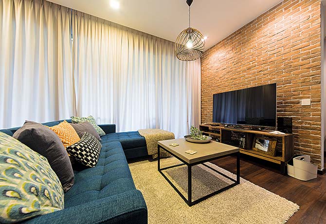
A cosy setting for lounging, the living area showcases well-executed arrangement of furnishings.
A cosy setting for lounging, the living area showcases well-executed arrangement of furnishings. Though the pieces don’t wear the same style — such as the contemporary L-shaped sofa or the rustic-looking TV console — they work great together.
Edmund describes the home as “Industrial with hints of eclectic flavours”.
Beyond Boundaries

The master bedroom used to enjoy a broader view but, now, one of the windows has been turned into storage space.
Said Edmund, “The homeowners needed additional closet space so a custom-made wardrobe and media console were built to fill in the window.”
The other window was also put to good use with its bay seat topped by a row of drawers and tall display unit. Edmund then applied a more soothing colour palette of teal and creamy grey tones on the remaining walls.
By Redzman Rahmat
Article first published in Lookbox Living #40 Mar/Apr 2015
Lookbox Living #44 is out now! Available at major bookstores and news stands!
For more interior projects, visit www.lookboxliving.com.sg
ADVERTISEMENTS


Leave a Reply