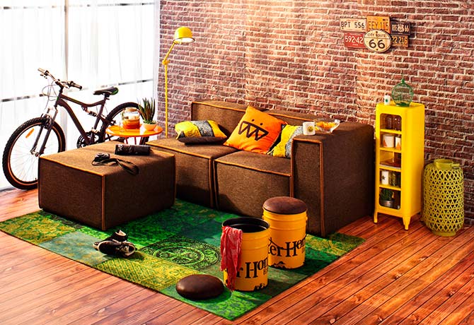
The colors vying for this year’s crown were in turns vibrant and subtle. It was a crowd-pleaser when the final chosen one was the best of both worlds
We see Copper Orange crowned as color of the year and we grew a special attachment to it.

Feminine and sweet
This color is right in the middle of a light pink and a warm orange. As such, it has elements of girly while playing around with hints of warmth. I personally love how it looks on the chair. We heard of royal red and regal blue, but who knew copper orange could be so apt even for furniture too?

Right on the comfy
We experimented using copper orange on our linens and as it turns out, it was lovely. The light hue worked perfectly on the curtains, allowing light to seep in beautifully, warming up the room. I have a special fondness for girly colors on my bed linens but pink has always been a little too much – copper orange meets me pleasantly!

Or just a hint
Because of its closeness to the colors pink and orange, it fits like quilt-work onto a color block painted wall. Clashing color walls work vibrantly but will cause weariness after a while. Complementing color walls, on the other hand, are classics and go spectacularly easy on the eyes.

As it fades
I love this color for its gentle sweetness, it is no surprise it works wonders with gradient tones. Imagine a base of maroon, then red, then pink, then copper orange. I would go on endlessly but you get the idea – you would almost feel the room lighting up as you enter.
Are you ready for Copper Orange too? Let us know!
By Nicole Lee
ADVERTISEMENTS


Leave a Reply